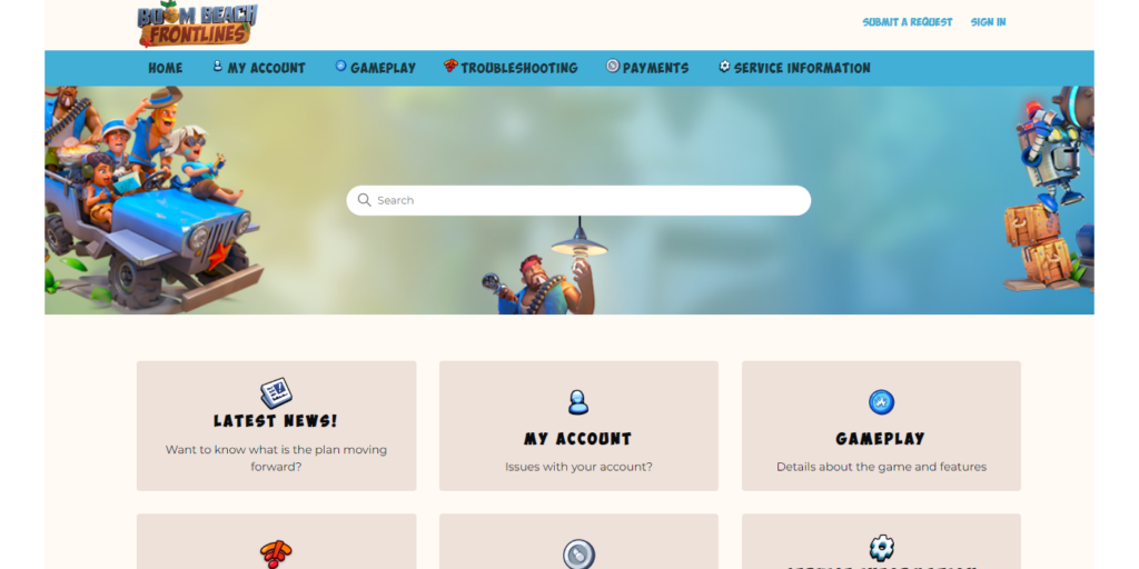
This is the official support portal of the Boom Beach: Frontlines game. I designed the portal and created content that provides players with solutions for in-game issues, helping decrease the number of support ticket submissions.
- Responsibilities: Knowledge management, Graphic Design, CSS, Analysis
- Tools Used: Zendesk Guide, Adobe Photoshop
- Target Audience: Boom Beach: Frontlines players
Process
With the soft-launch release of this new game, all the knowledge regarding in-game issues that players might face had to be created.
I started off by creating a list of all the topics that needed a dedicated support portal article. To get this information, I played the game to identify the issues that players might face and gathered the most common topics brought up by players who participated in previous closed playtests.
I also used data from our other games’ support portals to discover the most viewed and liked articles, as well as the keywords with no search results that most generated tickets, and used this information to determine the articles that should be written.
Knowledge management
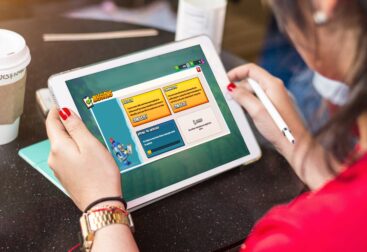
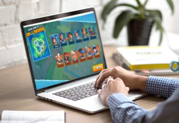
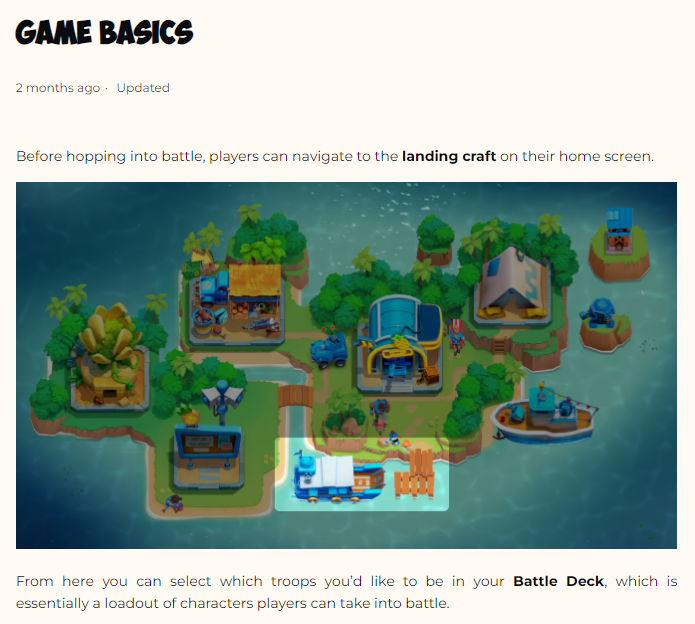
With all the content mapped out and the categories decided, I started writing the articles and gathering resources to illustrate the guides.
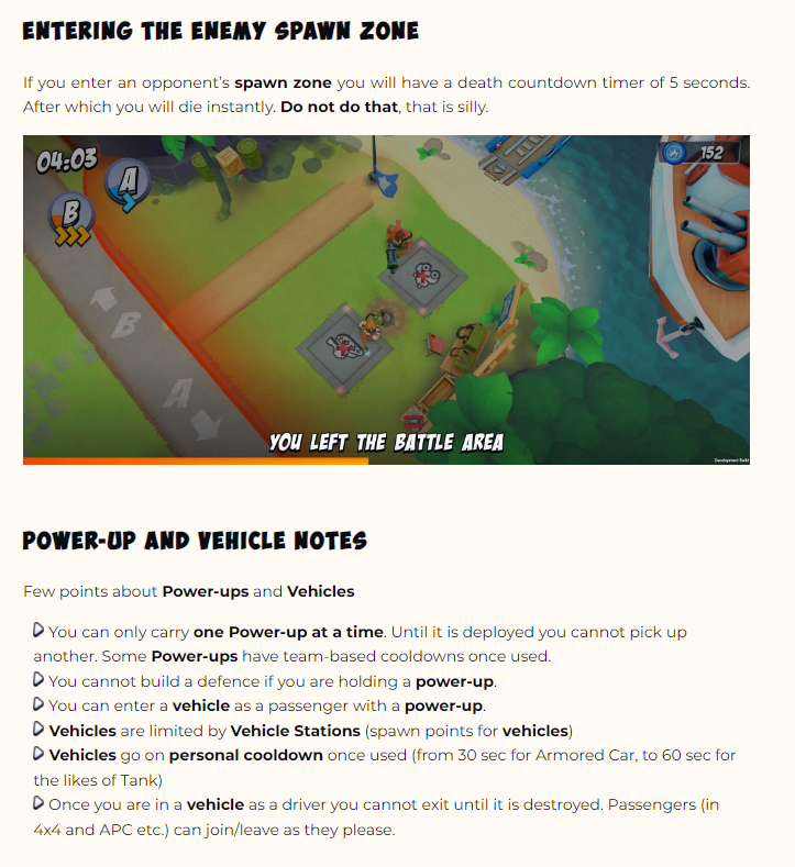
This means that I had a rather fun task of playing the game a lot while screen recording. I used Photoshop to create GIFs and images, to highlight certain gameplay aspects.
The knowledge management work on this portal is ongoing, by using Zendesk’s analytics to determine if any updates or new articles are needed, by checking the user behavior and the integrated Zendesk ticketing system allows me to view which articles are being referred the most by our agents, to check for any areas of improvement.
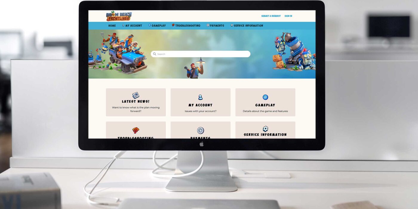
Designing the portal
Using a Zendesk Guide template as a base, I edited the CSS and some of the HTML code to get to the desired responsive layout. I used Photoshop to edit the assets from the game and Adobe Color to create a color palette.
It was a challenge to decide on the standard fonts in order to bring the game vibe without losing readability, but I was happy with the final result by using a combination of different header fonts.
The goal was for the portal to have the game identity while being functional and easy to navigate.
Check the live version here.